Projects
01 Ottawa Tourism – Website Design
02 uOttawa – Motion Graphics
03 Makenda Fitness – Brand Identity
04 Asuquomo – Visual Design
05 Amazon Café – Creative Direction
Website Design, User Experience Design, Copywriting
This is a conceptual redesign of Ottawa’s tourism website, focused on accessibility, seasonal storytelling, and user-centered navigation. The project includes a modular design system, interactive event filtering, and editorial-style content—bringing the city to life through local voices, curated guides, and a palette inspired by Ottawa’s natural and cultural landscape.
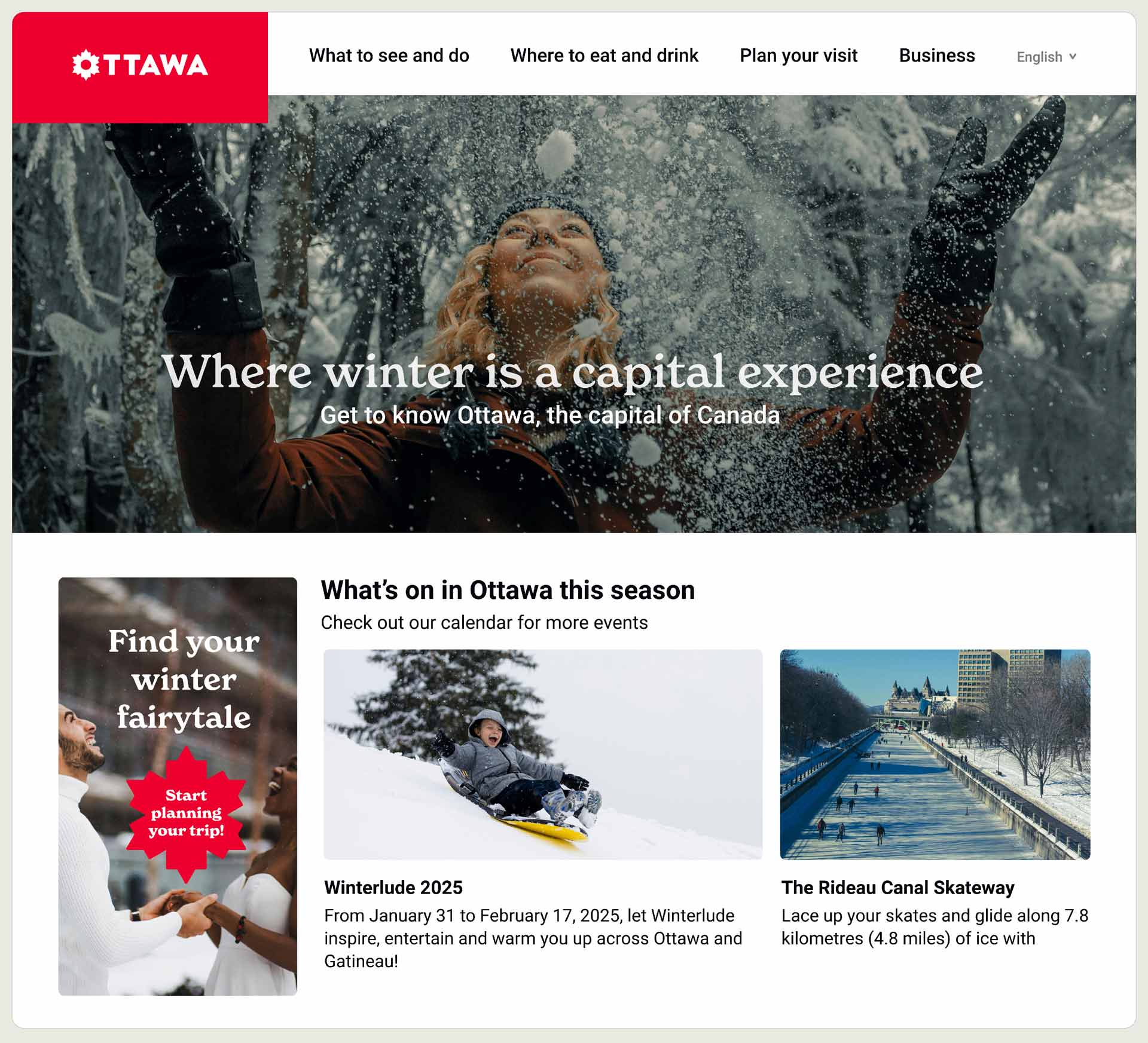
[1] A homepage design that highlights Ottawa’s unique character through each of the four distinct seasons.
[2] The layout highlights relevant content based on user goals, ensuring each persona can navigate with ease.
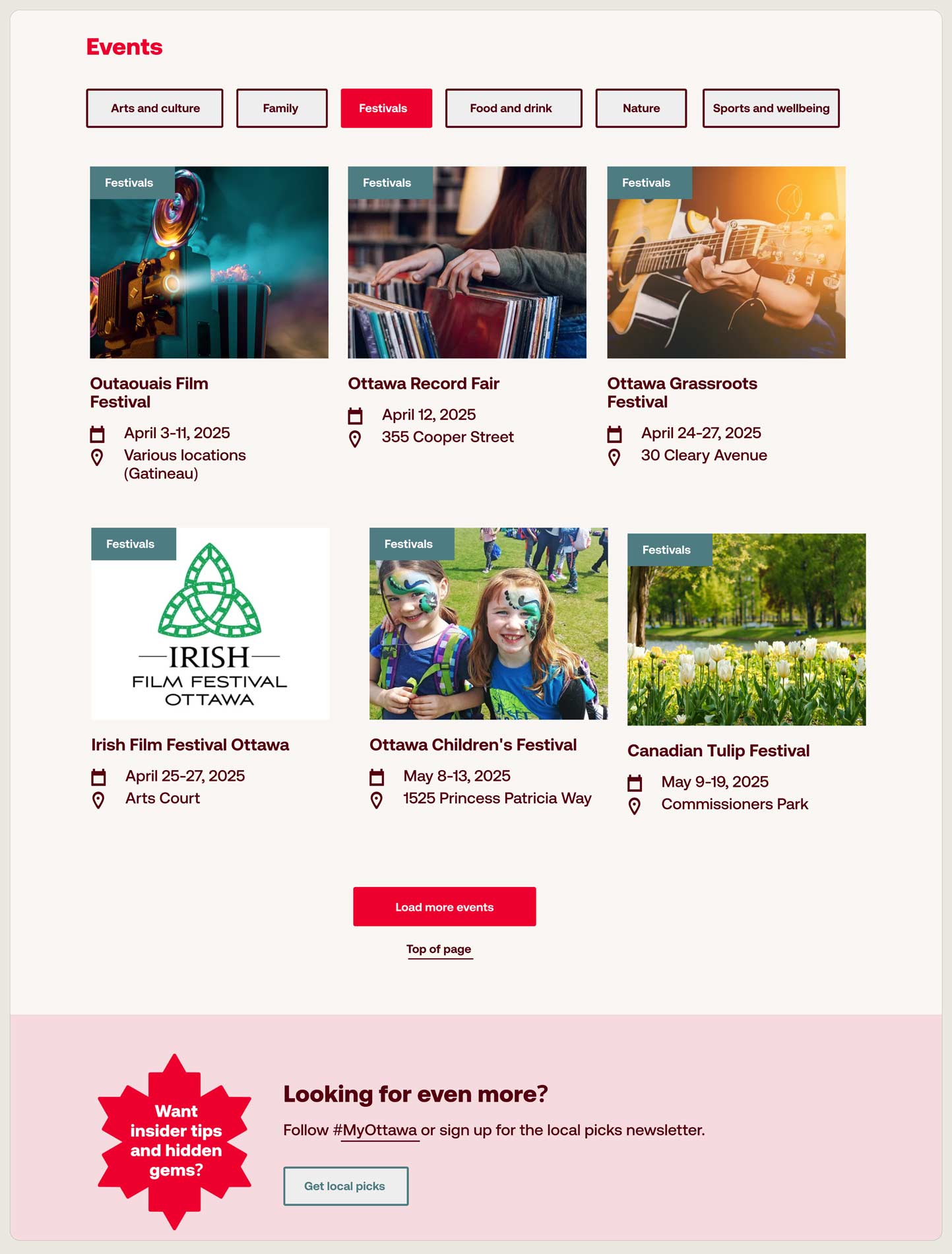
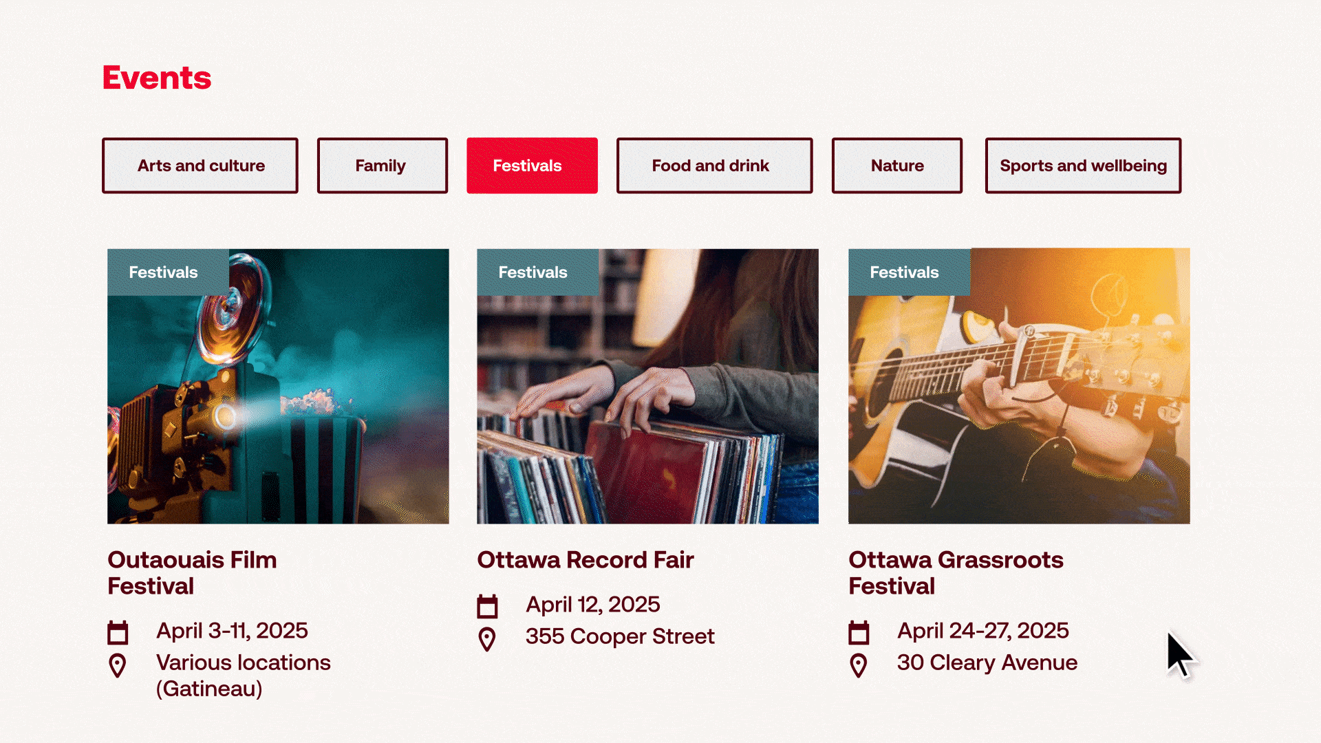
[3] Content has been restructured around user intent—grouping events, guides, and seasonal highlights into clear, intuitive categories.
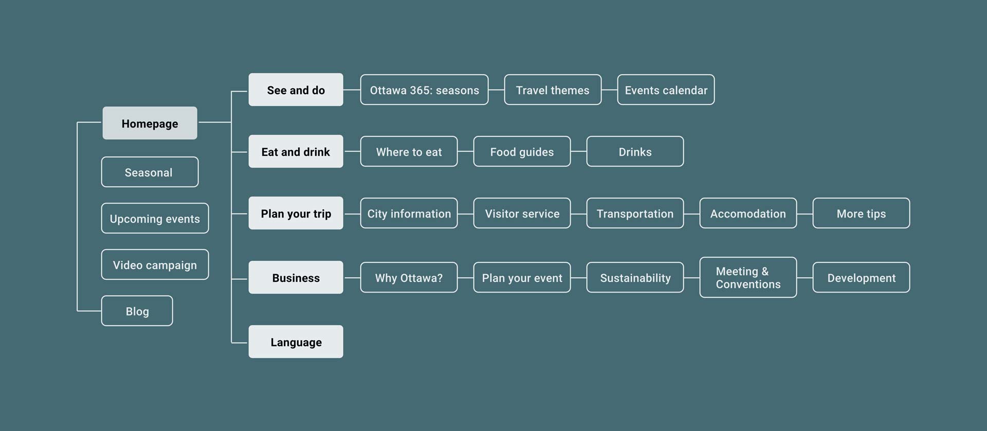
[4] Content has been streamlined to prioritize user needs, making it easier to explore the site by theme, season, or travel intent.
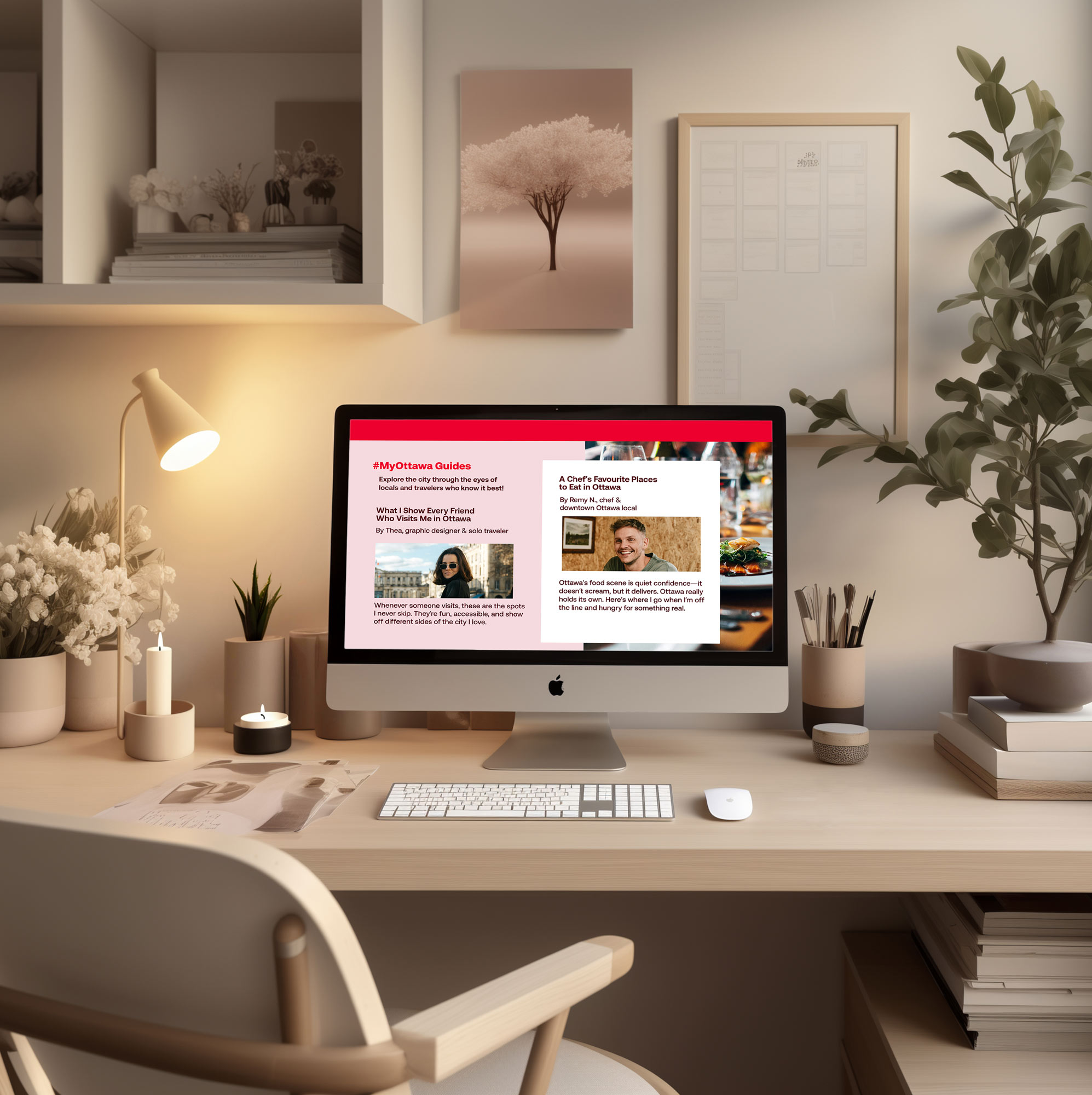
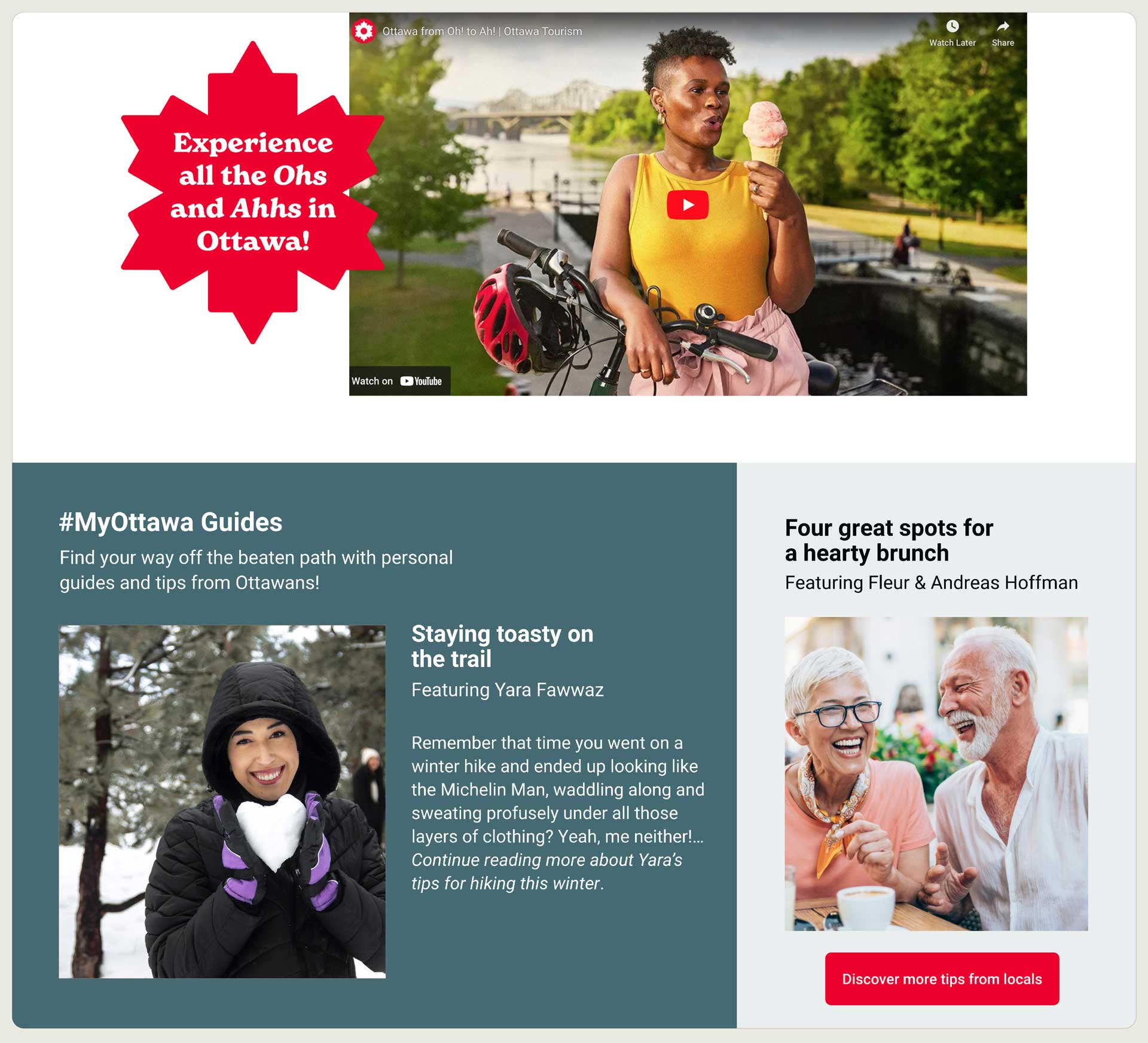
[5] A new blog format lives under #MyOttawa Guides, helping users explore the city through curated lists and real recommendations.
[6] Images feature a subtle zoom effect on hover, adding feedback and encouraging deeper user interaction.
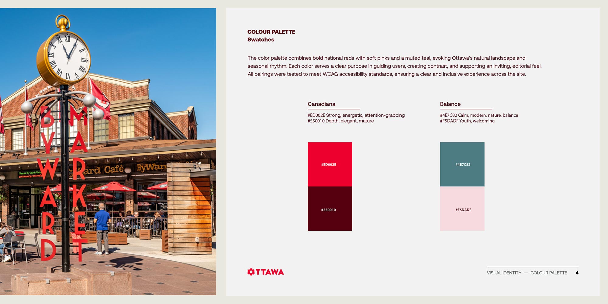
[7] A bold yet balanced palette inspired by the iconic Canadian Red, combining maroon, pink, and muted teal for clarity, warmth, and accessible contrast.
© COPYRIGHT JENNIFER YAYA FALANGA 2025